Atlanta: Welcome to Your New Transit Network

The Atlanta area transit agency MARTA finally implemented its bus network redesign, called NextGen, on April 18, 2026.  We led the network design and analysis tasks for the consulting team, and although it was a long and difficult journey, we’re proud of the results.  Now that the new service is running, I want to give a quick overview of what the redesign did, and the new opportunities it creates.  If you want to go deep into geographical detail, and understand why we made each routing choice, you can find our Final Report online here.

Here’s the big picture.  Old network on the left, new network on the right.  Note the legend: Colors indicate all-day frequency.  The wide grey lines on the basemap indicate the rail rapid transit network, which is all frequent most of the time.  Our more detailed map of the new network is here.)

The overall quantity of service we had to work with is slightly higher than in 2023 but lower than what existed in 2019.  This reflected the available resources and key policy decisions about priorities.  For example, the City of Atlanta has its own transit funding source, More MARTA Atlanta, but during the study process they chose to devote these funds entirely to future transit projects rather than short-term transit service.  That’s why there isn’t more service within the city.  As network design consultants, we work with the service budget that the agency has.  When I have been asked how much service Atlanta needs, or how much would attract good ridership, I say “much more than this.”  But that is not the question we were asked in this project.

Within those budget limits, we were able to increase by 22% the number of useful destinations the average person can reach in 60 minutes.  (For more about these access measures, and why they matter, see here.  For more on how we measured this in Atlanta, see the Final Report.)  This is the easiest way to describe why the network is better: more people will find it useful for more trips.

The old network had three major problems that we tried to address:

  • Low Frequency.  For a city of Atlanta’s size and density, there was remarkably little high-frequency service, which we define as service coming every 15 minutes or better all day.  The new network has much more frequent service, shown in red on the maps above.  Purple lines in the new network, running every 20 minutes, all deserve to be every 15 but our resources just didn’t go that far.
  • Poor Connectivity.  While the old frequent bus lines all connected to rail, they did not connect much with each other.  Most connections outside the rail system required multiple transfers at low frequency, without any particular timing of connections.  This made for long delays even on fairly short trips.  In addition to increasing frequencies and increasing the number of places where frequent lines meet each other for fast connections, we also introduced new timed connections at several suburban locations, enabling fast connections between routes even when the frequencies are low.
  • Buses Exclusively Feeding Rail.  The bus network had not been substantially rethought since the rail network was created decades ago, and its basic assumption was that buses exist to feed the rail network.  Virtually all routes in the old network ended at a rail station.  This is very unusual, and for good reason.  Many local trips in dense areas are traveling across the rail line, and this approach made the rail line a barrier for all those trips.  We questioned this as much as possible, though in many cases, infrastructure limitations forced us to continue the practice.

We’re especially proud of what we achieved in Downtown and Midtown, the densest place in the region.  Three lines now run continuously east-west across the city center — including the very frequent route 2 as well as the 11 and 51.  (Old network above, new one below).  (All these detailed maps can be fiound in the final report.)

Old network (above) and new network (below) in midtown Atlanta. Colors represent frequencies, using the same legend as in the first image above.

Of course downtown Atlanta would support a full grid of frequent lines, as comparable downtowns such as Denver and Los Angeles have, but with so few resources devoted to bus service, that wasn’t possible here.   Still, the new continuous routes across downtown will vastly improve access into and across the city.

One route with great potential was actually removed: the old north-south route 40 along Peachtree Street, the highest-density spine of downtown Atlanta.  This route ran right alongside the rail line but made more stops between the stations.  We observed that this route, if running frequently, would have very high ridership.  Comparable streets in similar cities certainly do, even with rail running beneath them, because the demand for local trips is so high and the time to access the station often isn’t worthwhile for short trips within downtown.

But with the budget we had to work with, and the need to divide service among the various parts of the region, we couldn’t afford the level of service that Peachtree Street would need, which would be every 10 minutes or better.  So we decided not to serve it at all.  The 45 minute frequency being offered was simply not relevant to the kind of market that Peachtree Street is.  Plenty of people are moving up and down the street and would benefit from the service, but most are doing so spontaneously, not on predictable schedules, so they will only use the service if it’s coming when they need it.  Without extremely high frequency, there wasn’t much point.

Thinking about the needs of disadvantaged communities was hard in this project.  In the Atlanta area, the greatest concentrations of low-income and minority populations are in the south and southwest, but southside Atlanta in particular has a very difficult street network.  There are north-south streets, but none of the east-west streets is entirely continuous across the area.  Freight rail lines, which made some crossings inoperable due to the disruptions long trains would cause, further complicate the picture.  That’s why we weren’t able to create as much of a frequent grid pattern on the south side as we would have liked.

The Atlanta area is also a world leader at building low-income apartment developments in places where efficient transit can’t get to them, often because they are on long cul-de-sacs or in locations that would require an awkward deviation.  This is where you’ll find many of the new on-demand or “microtransit” zones, which are the only way to get any service to some of these locations.   We also used one of these zones in the far west to cover part of the unwalkable Fulton Industrial Area, bringing people to a central point where they could connect to several fixed routes.  As always, these zones were designed to maximize coverage, not ridership.  Their purpose is to provide lifeline access to as many people as possible in the places where the geography is especially difficult.  They are not meant to be superior to fixed routes.  They are just a way of arranging service to get some coverage to areas where the design has made efficient fixed routes impossible.

If you live in the MARTA service area, I hope you’ll explore how the network has changed, and how it might be useful to you now.


New Sessions of our Intensive Transit Network Design Course: Portland and Chicago

We’re delighted to announce two new sessions of our “inexcusably fun” two-day intensive course in public transit network design.  This course, which we at Jarrett Walker + Associates have been teaching since 2011, is a chance to work intensively with me and our team to explore the challenges of designing transit networks in various geographies and situations.  It’s not just for budding transit planners, but also for advocates, executives, city planners, developers — anyone who wants to better understand how transit network planning works, and how it can support their own goals for their cities.  Read all about the course here.

Our 2026 offerings, both led by Jarrett Walker, will be:

  • July 30-31 in at Portland State University in downtown Portland, Oregon.  $525/student  Register here.
  • October 1-2 in downtown Chicago, just before the APTA TransForm conference.  $745/student.  Register here.

AICP Credit is available.  As usual, the Portland course is cheaper because we’re based there so we don’t have travel costs.

For questions about registration or to request an invoice, please contact Melissa Tverberg of our team, melissa at jarrettwalker dot com.

Please spread the word!


My Book Human Transit On Sale until 6/6!

My book Human Transit, revised in 2024, is your friendly, readable guide to how public transit planning works, and the choices that communities have to think about.  Whether you’re an advocate, a transit professional, or someone working in an adjacent field like urban development, this book will make you confident in your decisions and conversations about public transit in your community.

If you’ve been meaning to look at my book Human Transit, or know somebody who would benefit from it, now’s your chance.  It’s half price at Princeton University Press website until June 6.

You can read the preface and Table of Contents here.  You can also read the introduction from the first edition here.  Buy it here at half price until June 6!  Please spread the word!

Barcelona: el metro borracho y el autobús sobrio

[Read in English]

[En 2016 visité Barcelona por primera vez.  Esta es una traducción española del artículo que escribí entonces.]

img_0651

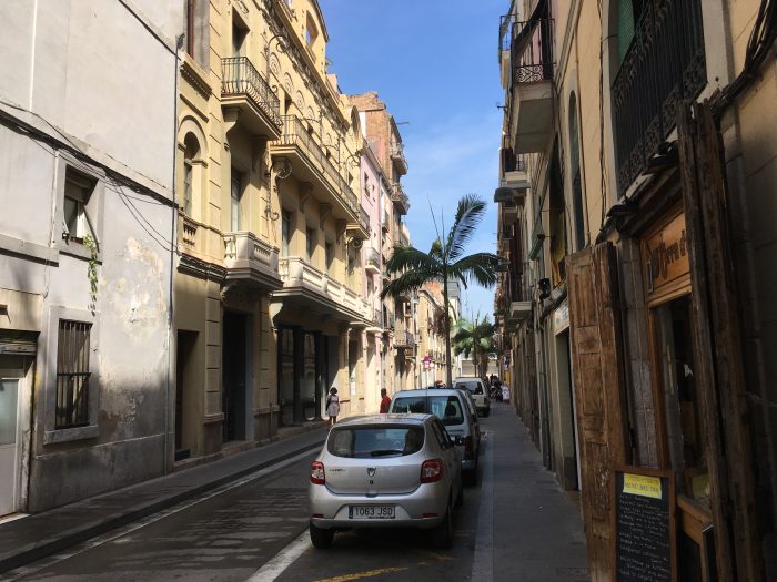
Barcelona tiene el tipo de sistema de transporte público que impresiona a un norteamericano a primera vista: un metro grande, autobuses agradables con numerosos tramos de carril exclusivo, dos funiculares prácticos, trenes de cercanías y dos redes de tranvía…

Es la forma habitual en que la mayoría de la gente resume un sistema de transporte, ¿verdad? Una lista de las tecnologías en uso, que no dice nada sobre lo fácil que es moverse por la ciudad. ¿Te has fijado en que, cuando dije «dos redes de tranvía», sonó al principio como si eso fuera mejor que una sola red de tranvía? Lo contrario es cierto, por supuesto, y de hecho están trabajando para convertirlas en una sola.

Al final, lo que importa no es la diversidad de tecnologías, sino lo fácil que es llegar a los lugares, y esto requiere otro tipo de turismo de transporte. En lugar de ir a una ciudad para maravillarse con las tecnologías —prefiriendo los tranvías a los autobuses sin importar a dónde van, y subiéndose a cada funicular, góndola y curiosa barquita— yo prefiero el turismo de acceso: intento ir realmente a lugares y experimentar lo fácil o difícil que resulta. (Sigo experimentando la casualidad afortunada, claro, pero esta destaca con mayor nitidez cuando se ve contra el fondo luminoso de la intención.)

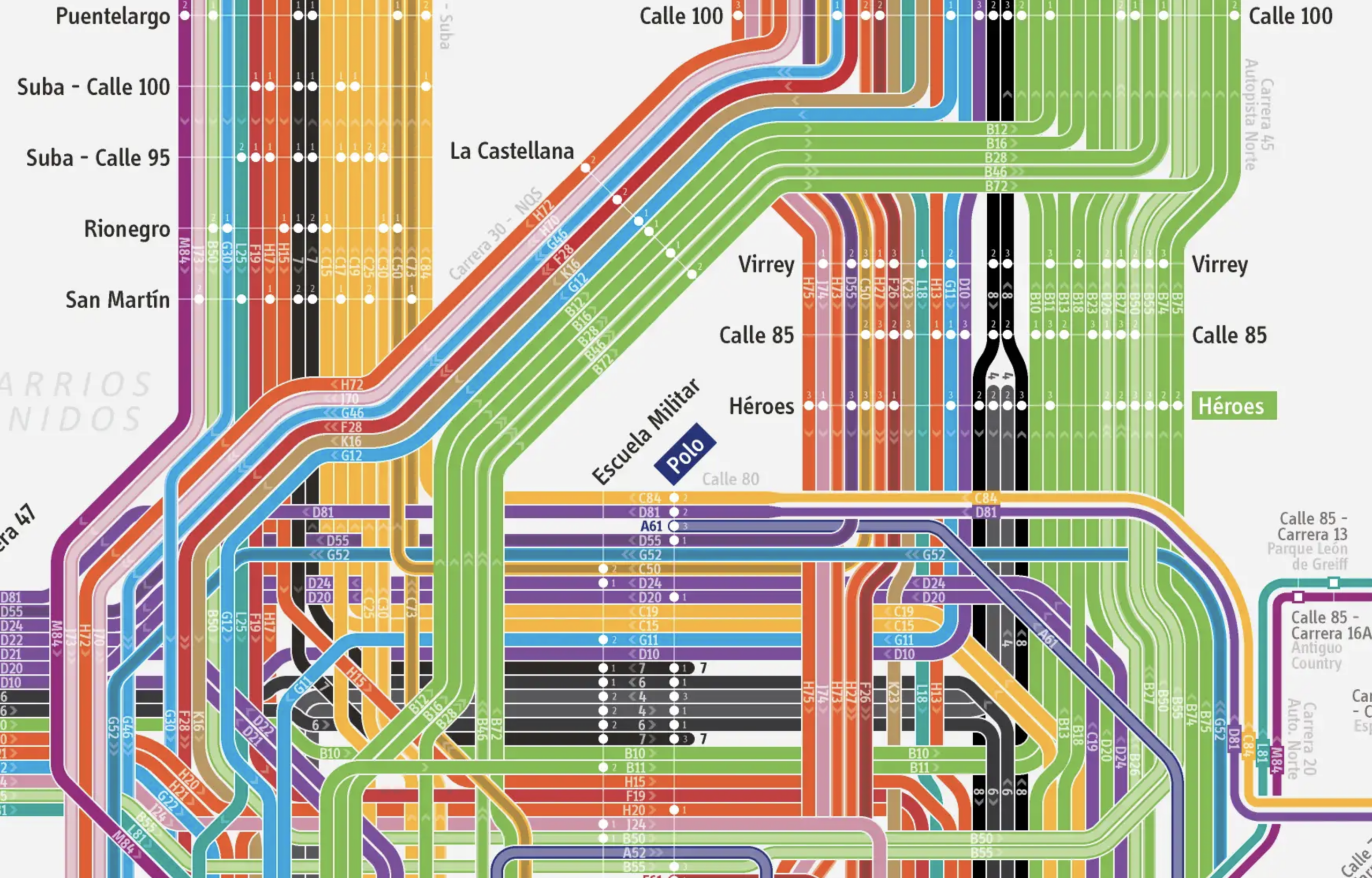
Solo viajar con intención me hizo notar la rareza del metro de Barcelona. El mapa completo de la agencia de transporte está aquí, y a continuación incluyo una sección. También puede gustarte la versión más austera de Jug Cerovic aquí. La red es complicada en parte porque muestra líneas de metro (L), líneas de tranvía (T) y líneas regionales de cercanías (R), pero para este propósito me centraré en las líneas de Metro (L).

Un poco de matemática sencilla: en una red en cuadrícula óptima, las líneas siguen más o menos rectas y se cruzan entre sí más o menos perpendicularmente. En esta red cambias de dirección haciendo un transbordo. La perpendicularidad maximiza el área de la ciudad a la que cada transbordo te puede llevar.

cxns-14-grid-types

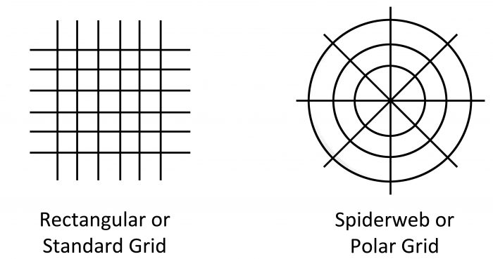
Las cuadrículas de transporte pueden ser estándar o polares, pero casi siempre son alguna fusión sutil de ambas. La cuadrícula polar surge cuando hay un gran centro en el que la red converge lógicamente, porque los destinos deseables se concentran allí más densamente.

Una vez que reconoces estos patrones, notas lo coherentes que son la mayoría de las redes de metro. Incluso aquellas que son apaños hasta cierto punto suelen haber sido remendadas todo lo posible para crear alguna fusión apropiada de los efectos de cuadrícula radial y estándar.

Pero entre los metros que he conocido, la red del metro de Barcelona parece inusualmente caótica en su estructura, dando a menudo la impresión de serpentear sin intención.

barcelona-metro-slice

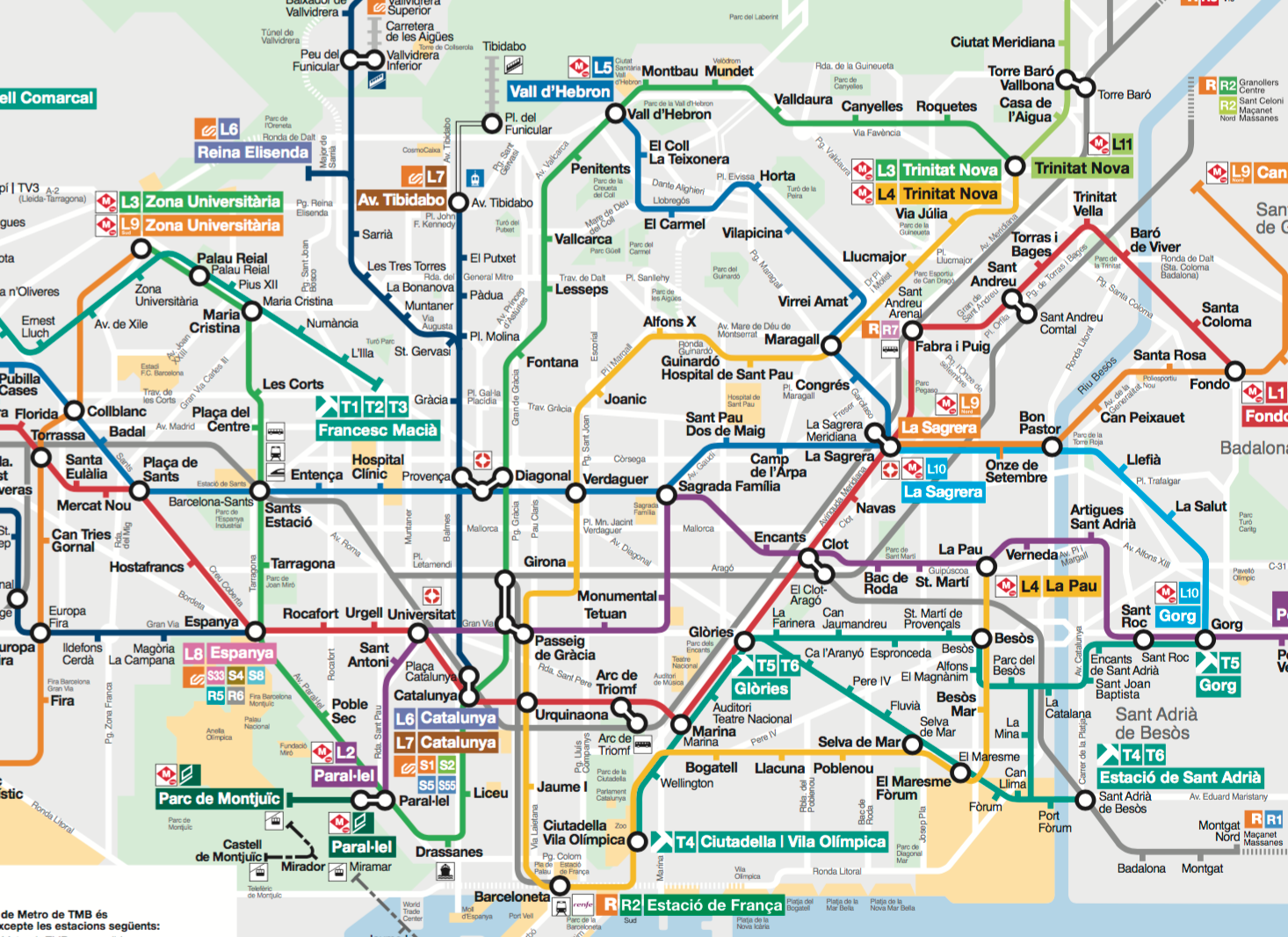
En el mapa de arriba, por ejemplo, fíjate en la línea azul intermedia que entra en el área del mapa por la izquierda en la estación de Pubilla Cases. Esta es la Línea 5. Atraviesa el mapa con resolución de izquierda a derecha, pero a dos tercios del camino a través de la ciudad, en La Sagrera, parece distraerse, girando de repente 120 grados y dirigiéndose hacia las colinas en la parte superior del mapa.

La red también está llena de líneas que se encuentran tangencialmente en lugar de cruzarse. Por ejemplo, aquí tienes un diagrama solo de las Líneas 5 y 2 (azul oscuro y morada, respectivamente) tocándose tangencialmente en la estación (no señalada) de la Sagrada Família:

l5_l2

Hay numerosos casos como este. En cada caso tendrías una red más coherente —más capaz de conectar a más personas con más destinos y con menos transbordos— si las líneas intercambiaran trayectos en este punto, cruzándose una sobre la otra en lugar de tocarse tangencialmente.

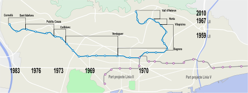
De nuevo, la mayoría de los metros son apaños hasta cierto punto. Es poco probable que alguien vivo hoy en Barcelona merezca culpa por los extraños patrones del flujo del metro. Siempre hay razones históricas para que las cosas hayan terminado como están. Si quieres seguir esa historia, aquí tienes un vídeo entretenido.

Pero mientras tanto: ¿tienes en la cabeza alguna idea recibida del estilo de «los metros europeos son tan fantásticos que ¿por qué iba alguien a coger el autobús?»? Recuerdo cuando muchos europeos solían creer esto, pero hoy en día la mejora de las redes de autobús es una de las tendencias europeas más importantes. La necesidad de una red de autobús racional puede ser aún más urgente si tu metro va dando tumbos como un borracho, incapaz de seguir una línea recta.

Lo estupendo de la nueva red de autobuses de Barcelona, entonces, no es solo que sea una cuadrícula, sino que de verdad quiere que sepas que es una cuadrícula, y lo rectas que son las líneas que la componen:

barcelona-new-bus-network

Las nuevas líneas tienen números precedidos por «H» o «V» para «horizontal» o «vertical». (Vertical es bastante literal: no solo arriba-abajo en mapas estándar como este, sino también hacia arriba a las colinas o hacia abajo al mar.) Estas líneas frecuentes están además numeradas en secuencia lógica a lo largo de la ciudad, de modo que, a medida que conoces la red, un número te recuerda aproximadamente dónde se sitúa cada línea dentro de la cuadrícula y, por tanto, para qué es probable que sea útil.

La idea es que la gente debería poder mantener una noción de toda la red en cuadrícula en la cabeza. Si simplemente recuerdas qué significan H y V, y la secuencia en la que están numeradas, dispones de una enorme cantidad de información sobre todo el sistema. Cuando ves cualquier autobús numerado de esta manera, tienes un sentido general de hacia dónde va, o al menos a lo largo de qué eje. Y cuando oyes el número de una ruta de autobús, puedes formarte fácilmente una idea general de dónde se encuentra.

Hay libertad en este tipo de legibilidad. Podrías medirla en términos del número de lugares útiles a los que puedes llegar dividido por los bytes de información que necesitas recordar para tener un mapa funcional de cómo llegar allí. Cualquiera que haya navegado por Manhattan conoce la diferencia entre la cuadrícula regular en la mayor parte de la isla (alta utilidad/byte) frente al laberinto sin patrón de calles en el extremo sur (baja utilidad/byte). Las ciudades europeas tienden a ser especialmente difíciles en este sentido.

Hablo mucho de la red de autobuses de Barcelona porque es uno de los mejores ejemplos de la divulgación de la legibilidad a escala de red, una idea casi inaudita en otras partes del mundo. (Quizá relacionado, también tiene un artículo en Wikipedia que la describe con el mismo respeto que cabría esperar al hablar de una red de metro.)

Barcelona pudo dar con su red de autobuses en cuadrícula, en parte, porque las cuadrículas legibles y orgullosas ya eran su idea de planificación urbana más célebre. La mayoría de los trazados de calles europeas carecen en gran medida de cuadrícula y son irregulares. Pero en una visión sistematizadora rival de la de Haussmann en París, la Barcelona del siglo XIX adoptó un único patrón en cuadrícula para su rápida expansión alrededor del núcleo medieval.

Photo by Alhzeiia via Wikipedia

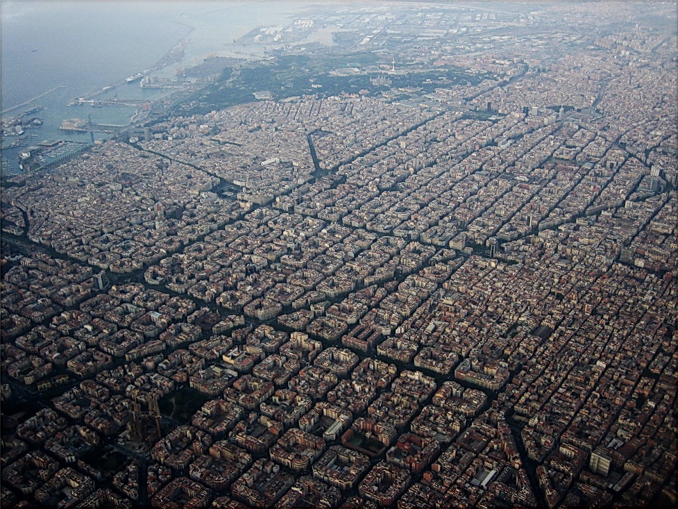
Foto de Alhzeiia vía Wikipedia

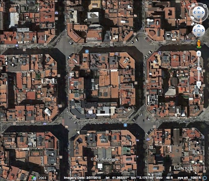
A este plan se le suele llamar el distrito del Eixample, pero es realmente un principio más que un lugar. (La palabra catalana eixample significa «extensión» o «área ampliada».) La nueva cuadrícula recorre la ciudad a lo largo de unos 7 km (4,5 mi). Por tanto cubre muchos barrios, uniéndolos no solo con un trazado de calles perfectamente regular, sino también con el detalle más distintivo de la cuadrícula: las esquinas «achaflanadas» que crean pequeños espacios cuadrados en cada gran intersección.

eixample


Ahora que Barcelona está empezando a cerrar muchas de estas calles al tráfico rápido de coches, estos pequeños rombos serán los próximos grandes espacios públicos en una ciudad ya rica en ellos. Y una gran red de autobuses, cuyo patrón en cuadrícula a escala de toda la ciudad puedes recordar, y que para justo a la vuelta de la esquina, te llevará allí.


Gracias a mi amigo barcelonés Andreu Orte por el contexto, incluido el diagrama de las Líneas 5/2.


Words to Abolish: “Choice Rider,” “Captive Rider”

You can’t go far in transit conversations without hearing the terms “choice rider” and “captive rider.”  The first refers to someone who has a car available and chooses transit instead, while the second refers to someone who has no choice but to use transit.

Anytime you hear someone using these terms, please point them to this post.  For more detail, please see the full argument in my book Human Transit (revised edition of 2024).  It’s at the end of Chapter 4.  But briefly:

These terms are legacies of 1970s modeling, which required many simplifying assumptions to fit the limited computing power of the time.   They reflect the class prejudices of the time, but they have never had any scientific basis.  The underlying idea is that “captive” riders will use the service no matter how bad it gets, and that the path to growth is to attract the “choice rider.”  This has been disproven over and over.

Transit succeeds or fails by recognizing that most people are in the middle, with some choices and some constraints. That means almost most people can be gained or lost as a rider depending on whether the service is useful to them. Some of the late 2010s ridership loss in the US was among riders who’d be categorized as “captive.” Service was too useless for them so they bought cars. Is this a surprise? If you call people captives, and reflect that view of them in your services, it makes them try to escape!

These terms also do political harm: “Captive rider” is insulting to those who live good lives without cars, while “choice rider” is misleadingly flattering to the most fortunate.  The latter term also encourages elite projection, the tendency of very fortunate people to assume that they are the customer for whom transit should be designed, even though there are not enough of them to matter.

When I talk about this, people often suggest other terms for these categories.  But the problem is the binarism itself.  When you try to define a spectrum by its extremes — especially when talking about something as emotive as social class — you tend to exaggerate differences and encourage polarization, because these terms suggest that everyone is in one of two categories instead of scattered along a spectrum.  Using different words can make it less offensive but no less polarizing.  So when I have to talk about this, I tend to speak of lower-income riders without cars as somewhat dependent but I would never say captive or refer to transit dependents as a noun.  For the other end of the spectrum I often use the word fortunate or to soften and emphasize the spectrum, relatively fortunate.

“Choice” and “captive” sound scientific but they actually serve to insinuate that some people are just more important than others. I will continue to work to strip these terms from the language. Every potential transit rider has some choices, and every one of them matters.

Bogotá: Una imagen de la verdadera complejidad de TransMilenio

(Read in English here.)

Mi reciente artículo sobre el sistema de Bus Rápido de Bogotá, TransMilenio, terminó con un texto sobre la extrema complejidad de los patrones de servicio, y el papel que esta complejidad juega en los muchos problemas de los que la gente se queja. Resulta que existe un diagrama elaborado con mucho cariño y detalle de todos los patrones de servicio de TransMilenio. (Es obra de alguien que se hace llamar el Clarion Project, pero supongo que no se trata de la fundación estadounidense del mismo nombre.) Prepárate:


El mapa completo en todo su esplendor está aquí.  (Haz clic para que aparezca la imágen, y otra vez en la imágen para toda la detalle.)

Resulta abrumador, pero sigue siendo realmente útil, al menos para los amantes de los mapas como yo. Ojalá lo hubiera tenido cuando estuve en Bogotá a principios de este año. De hecho, ojalá TransMilenio lo publicara, aunque solo fuera para quienes encuentran útil este tipo de representación.

Pero aun si no eres una persona de mapas, necesitamos estas imágenes para ilustrar el problema. Al identificar cuidadosamente cada patrón de recorrido y cada parada, el mapa representa honestamente lo complicado que realmente es TransMilenio, y no es posible arreglar un problema si no se tiene una buena imagen de él.

¿Por qué es TransMilenio tan complicado? ¿Qué problemas podrían resolverse al simplificarlo? Mi artículo sobre eso está aquí.

Bogotá: How Complicated is TransMilenio? Now There’s a Picture!

(Español aquí.)

My recent writing on Bogotá’s Bus Rapid Transit system, TransMilenio, ended with an article on the extreme complexity of the service patterns, and the role this complexity plays in the many problems that people complain about.  It turns out that there is a lovingly detailed diagram of all of TransMilenio’s service patterns.  (It’s by someone calling themselves the Clarion Project, but I’m guessing this is not the US-based foundation of the same name.)  Brace yourself:

The whole map in all its glory is here.

It’s overwhelming, but it’s still really useful, at least to map people like me.  I wish I had had this when I was in Bogotá earlier this year.  In fact, I wish TransMilenio published it, just for those who find this kind of representation useful.

But even if you’re not a map person, we need this images to illustrate the problem.  By carefully identifying every routing pattern and every stop, the map honestly represents how complicated TransMilenio truly is, and it’s not possible to fix a problem if you don’t have a good picture of it.

Why is TransMilenio so complicated?  What problems could be solved by making it simpler?  My piece on that is here.


Our Fun Transit Network Design Course Comes to Portland and Chicago

Have you heard about our “inexcusably fun” two-day courses in transit network design?  We have two sessions coming up this year:

1. July 30-31 in Portland, Oregon
2. October 1-2 in Chicago, Illinois (just before the APTA Transform conference)

You can read about the courses here.

Keep an eye on this blog (you can subscribe using the button at right)for registration and cost info, which will be coming in the next week or two. Meanwhile, save the dates, and please share!

Vancouver: The Grid Thickens

Vancouver, Canada is a great transit city not just because it pioneered driverless rapid transit, or because of its commitment (somewhat enforced by geography) to a dense and walkable urban form.  It’s also a great transit city because of great bus service planning.

Vancouver area transit agency TransLink is out with a new plan for the next 15 years of bus service growth in the densest and most transit oriented part of the region, including all of the City of Vancouver itself.  They call it the Burrard Peninsula Area Transit Plan.  It’s worth perusing, but here, I just want to flag one image that may be of global interest:

The black lines are SkyTrain, the driverless rapid transit system, including its newest extension.  The grey and blue lines are existing bus routes.  The purple are new bus routes they propose to add over the next 15 years.

By the time this plan is implemented, most of the blue and grey lines on this map will be frequent: every 15 minutes or better all day. Many of them already are.  This map shows the current Frequent Transit Network.

Why is frequency in a grid pattern so valuable?  Every time two frequent lines meet, especially at a right angle, the result is an explosion of usefulness, because each line becomes useful to get to all the points on both lines.  In an ideal frequent grid network, you can go from anywhere to anywhere with a single transfer on an L-shaped path.  It’s such a powerful concept that many cities whose street networks are not especially gridlike still try to achieve that effect.  I discuss the example of San Francisco in Chapter 13 of my book Human Transit.

A grid works best when everyone can walk to either a north-south frequent line or an east-west frequent line.  For that reason, Vancouver transit planners have always ruminated over the gaps in their grid, mostly cases where east-west lines are too far apart.  The new purple lines fill ALL of these gaps.  Across all of Vancouver and western Burnaby, there will finally be service both north-south and east-west near everyone.

Of course, what makes this possible is not just the grid of streets, but the rising density across so much of this area.  Vancouver housing is not just the famous 40+ story towers, which are mostly clustered downtown and around rail stations, but many small apartment buildings or large homes that are being divided into smaller units.  Vancouver-based experts such as Brent Toderian are promoting “gentle density” or the “missing middle”, encouraging more development of 3-7 stories or so that fits better with the historic character of neighborhoods.  This transit grid helps expand the range of places where that density is livable.

Again, the regular grid pattern of arterials makes the transit grid easier, but you can get grid effects in any city of reasonable density and walkability.  Just maximize the number of situations where frequent lines cross at right angles, expanding the usefulness of both lines. Then build stuff at those intersections!

Vancouver’s agency TransLink has been a big part of my career.  I was an on-site consultant there for a year in 2005-6 and also for the summer of 2011, and our firm continues to work for them now and then.  During my on-site time I did a lot of work on helping them formalize and strengthen the frequent transit network concept, and also build the grid.  It’s great to see this idea continuing to prosper.