Recently I posted on the importance of frequency mapping in network maps. Most transit network maps, I argued, show all the transit lines but make it impossible to sort through them to figure out, quickly, which are likely to be useful. The bottom line: A map that makes all the lines look equally important is as useful as a road map that makes a freeway look just like a dirt road.
Ever since then, we’ve seen a burst of creativity from Human Transit readers. I’ve featured some of the most interesting experiments on the blog over the past couple of weeks, and hope to have more to share. But Zef Wagner was right on with this comment:
You know, we can make great transit maps all we want, but transit agencies might not use them. However, there is nothing to stop the folks here from making smartphone apps! I use google transit pretty often, but it only tells me how to get from A to B, it doesn’t show me all the possibilities. I would love to have an app that gives me several options–frequent network, night-time service, peak-only, etc. The most popular transit app in Seattle is called OneBusAway, and it doesn’t come from the transit agency. It was written by a University of Washington student and is free in the app store and shows real-time arrival for every bus stop. What I’m saying is, the smart folks here shouldn’t just mess around with map-making–take it out into the world, even if transit agencies don’t have the will or resources to buy into these ideas.
I couldn’t agree more. Why does the world wait for transit agencies to draw transit maps, anyway? Would you expect your highway department to make the only valid map of the highway system?
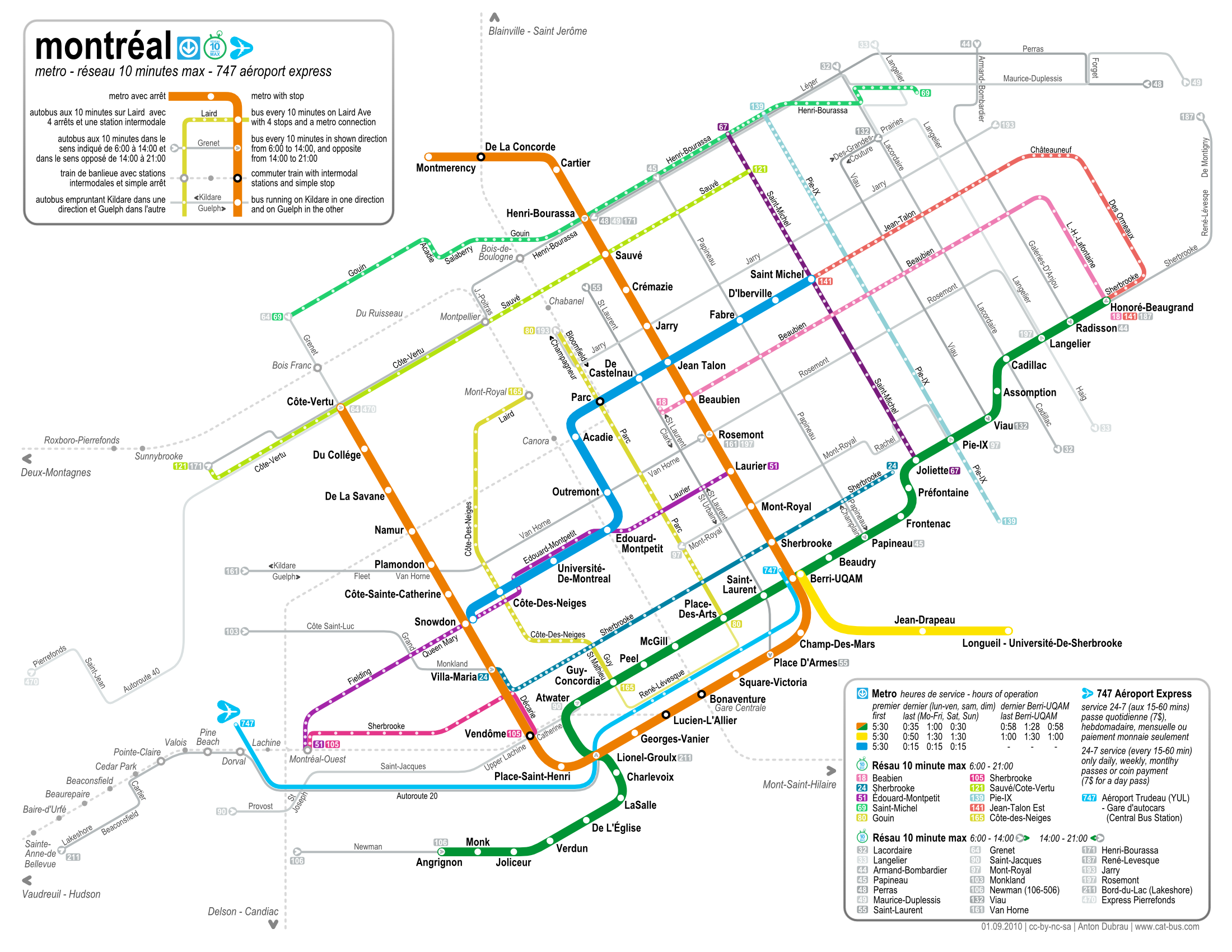
Think widely about everyone who would value a Frequent Network map, for example, like this clear and beautiful map of Montréal’s by Anton Dubrau. Just one that comes to mind: tourism. Tourists need to figure out a city fast, and the Frequent Network is just the right level of detail for a lot of cities, especially in the New World.
Guidebooks to cities usually reproduce the map of the rapid transit system, and then mention that there are a lot of buses wandering around. This may be fine in a European or East Asian city where the rapid transit network is comprehensive, but it’s deeply misleading for a city where rail transit is fragmentary and buses are doing the rest. Shouldn’t a guidebook to Los Angeles or Brisbane or Auckland show a map of the Frequent Network, rail and bus? This network, after all, is by definition frequent enough to be used spontaneously. And there are plenty of tourists who aren’t afraid to ride buses, if they can figure them out.
Perhaps you’ll pitch a map to Lonely Planet, or perhaps you’ll find your own marketing angle. Maybe you’ll just create the definitive online source for Frequent Network maps, or automatically-generated system maps, or maps with layers that you can turn on and off, or phone apps of all of the above. Once you’re online, sell some ads along the side.
Many readers of this blog have shown they have the tools and skills to create excellent map products, not just the phone apps that Zef mentions but also a range of other online and even — gasp — printed maps. All you need is a little business skill, some time to invest, and maybe a trusted transit consultant looking over your shoulder.
Have you seen this map of Melbourne’s train + tram networks? It’s sort of a bit like a railfan’s attempt to make a useful map. It shows trains and trams as “the same” (which looks like a bad idea), but does contain some interesting ideas: It includes service frequencies as well as showing how long it takes at various points along the way to get into town. Which is really useful, because at some point it takes twice as long by tram as by train to get in. Black lines are metro trains, colored lines with stops are trams, without are regional trains.
It doesn’t come anywhere near close to pretending to showing scale, and you look at it and get information overload, and probably resolve never to use pt in Melbourne if that’s what it’s like, but I do like the way it shows a lot of timetable information in it. (It also needs to show some semimajor bus lines, particular the “DART” buses from the Doncaster area and the orbital routes.)
The “GTFS” data provided by the transit agencies for the google maps program. Could actually be used to draw a map of high freqeuncy routes. If google implemented such a thing on their maps program. Or someone could create a website or app for the smart phones doing such a thing.
You could even take it one step further. In google maps have parameter settings on the side. You could tell it to highlight only express limited stop bus routes. Highlight on bus routes with 10 min or better frequency during certain hours of the day. If a street has more than one bus route. You could tell it to only list 10 min or faster for only one bus route on that street or if it doesn’t matter what route between two points. Then any bus route on that street might be highlighted in that segment.
The point is the data is available. It just needs to be used as it was meant to be.
The frequency maps I put together at Routefriend (http://routefriend.com/frequencymap.html) are based on the same idea as Paul C mentioned above.
I’m working on some tweaks so that they load faster and other ideas, like highlighting rapid stops or rail differently than the rest of the system would be pretty easy to add. Making it into a smartphone app would be fairly possible as well.
The big thing that’s missing is having the map look elegant. As Jarrett mentioned (http://www.humantransit.org/2010/09/frequent-network-maps-by-routefriend.html), nice side-by-side drawings would really enhance their usability.
If anybody thinks they may be able to help on the visual appeal, please give me a shout-out at http://routefriend.com/contact.html
I’d would like to do more than just randomly throw a map on the web. So I am open to these ideas. But all this takes time (and some other investments); and there’s a thesis that needs to be written…
One of my worries about this is that one might be sued by transit agencies if one attempted to profit commercially from such a map. Yes, that wouldn’t happen in a sane world, but the world we live often does not seem sane when it comes to copyright and what by rights ought to be publically available information.
JFruh, it is legal to produce maps of geographical features. Drawing your own map of transit is as legal as drawing your own map of your neighborhood. However, if your map does not base itself on sources other than the official map, or if it uses similar style to the official map, then it could be considered derivative work (=we 0wnz y00). Transport for London are huge assholes to people who make unofficial Underground maps; other cities, not so much.
Why does the world wait for transit agencies to draw transit maps, anyway? Would you expect your highway department to make the only valid map of the highway system?
As Alon says, if the highway system sued anyone who tried to sell an alternative map, then yes, I would. 🙂
When I made my San Francisco transit map, I made it Open Source, in Inkscape (SVG) in case others wanted to maintain or improve upon or customize it.
-danny
I wait for transit agencies to draw transit maps largely because transit is different from highways in that it benefits much more from schematization and “hand-drawing”. Even geographic maps — which are really the only kind that technology can produce — benefit from a custom design that makes crucial things such as transfers, frequencies, or routes easier for users to understand.
Yeah, it’s encouraging to see technology allow *certain* kinds of maps to be more-or-less automated, but IMHO there’s no way it can replace a well-designed map done by hand.
Street maps show a lot less information than transit maps, and streets stay pretty much as they are once they’re built. A company can make a street map once, and then sell it for years. A company could make a transit map, but the routes might change three times a year. A third party could keep up-to-date maps for multiple transit organizations only if they provided timely information on when and how routes change in some standard format.
To make it even more difficult, bus routes can be loopy and complicated, even in gridded cities, which means an accurate map must be cluttered to show the complexity.
For example, Vancouver has very logical local bus routes that follow arterials in straight lines outside the downtown. This is easy to show well. These routes almost never change.
Once downtown, the bus routes tend to switch to parallel streets, loop around, or turn multiple corners. There are routes on 6 of 7 parallel streets, most with frequent service. Any map that shows this accurately will look like a bowl of spaghetti.
The map the agency publishes hides the complexity by using a single colour for all routes, and placing route number labels at various points along the route. Some routes are ambiguous.
I tried to make a route map, but I’m completely unhappy with the results. I’m not sure it’s possible to do well.
http://img13.imageshack.us/img13/4237/downtownbusesasis.png
I tried to simplify routes and turn Granville back into a pedestrian zone. I still don’t like it.
http://img178.imageshack.us/img178/1552/downtownbusesproposed.png
The agencies route maps are at translink.ca
@rhywun Transit agencies aren’t the only ones who can draw maps by hand. Jarrett’s saying that we (not only transit agencies) should go and create (‘draw (by hand)’) usable transit maps for print and apps. I think.
@mikef
Ditch the geographical accuracy. The Montreal map has huge scale changes throughout, maybe up to a factor of 5. I started with just drawing the bus lines as a grid on paper, without any geographical accuracy.
…also your lines are very thick, but your map is very small. Choose a larger format, but keep the details small.
If none works, you could also put a zoomed in section of downtown in the corner, like the Chicago map.
@Ant6n “put a zoomed in section of downtown in the corner, like the Chicago map.”
+1
When I made my New York maps, the main challenge was to collect the set of frequent buses. Drawing was tedious, and I had to make some simplifications for routes that have short one-way pair segments, but it only has to be done once.
Ideally, a transit agency would have a customizable map, allowing you to check boxes for all buses you want to see. That would also take care of questions like 10 versus 15 minutes, or 8-7 versus 6-9.
@jfruh in regards to your statement about possible copyright infringements.
That is why I suggest google maps would actually be the best program. Google just needs to add the necessary parameters to its mapping program. Right now you can pick a departure time or arrival time to any transit stop. So long as your transit agency has provided up to date GTFS data to google. All google needs to to is add more setting on the side so that you could break things down more. Or when it does draw out your route on the map. Put different colour codes on the route for high frequency or limited stop.
I’m not suggesting people create static maps based on the GTFS data. Static maps being pointless as soon as any transit agency changes a route.
@ Felix – speaking of DART, here’s my attempt at a frequent service map for it (and the surrouding area) http://melbourneontransit.blogspot.com/2010/09/frequent-service-map-2-melbournes-north.html
The most important thing to help out with innovative mapping is to feed the phone app market right now. App mapping is leading to open source standards (since cities are interested in “joining the rest of the world” to benefit tourism and so on) and should give transit agencies an incentive to share information more effectively (and, we hope, indeed to help them understand themselves better).
The real time location feature for Google’s BART map is a great example of what can be done…so having more showcase examples like that will generate very interesting maps and hopefully new ways of thinking about route-mapping.
Dynamically rendering maps has interesting implications. Dynamic mapping offers a way to circumvent the overlap problem when using static lines…and, indeed, even offer solutions to eschew the dominance of the graphic line altogether. When routes get loopy and overlappy the graphic lines can dissolve for communicative purposes, emphasizing stops and destinations. Lines could be indicated instead with movement of dots in sequence, and that movement can help communicate overlap and continuity in a dense downtown network with greater clarity.
Drawing frequent network maps for the all cities near me easy…. a blank map! 😉
(greetings from Arkansas)
Great idea, Jarrett. But it can be even easier than getting Lonely Planet onboard. Someone in my community hand drew a stair map of Queen Anne (in Seattle), had them professionally printed, and sells them in local book stores for $5. Total costs of production couldn’t have been more than a few hundred dollars, and the only people he had to convince were the bookstore owners. Taking this a step further, my favorite map of Bangkok was hand drawn by someone using pens and highlighters then copied and sold in travel stores internationally (bought mine in Seattle).
There’s no reason people can’t start small at local book stores, drug stores and travel stores, and expand by calling up travel stores in other cities. Then maybe you work your way into Lonely Planet.
Another interesting variable to throw in the mix would be the amount of time to travel between points in a system.
For a silly side note check out these maps I discovered through the awesome blog information is beautiful:
http://www.informationisbeautiful.net/2010/four-great-infographics-no-9/