In 2012, I worked with the transport authority of New Zealand’s largest metro area to design a new bus network for the fast-growing region. A key idea was to replace a tangle of infrequent services with a simpler, more frequent network. People would need to change buses a bit more, but they’d be able to get to more places sooner
Small parts of this network were implemented in 2015-16, but the first big slice was the South Auckland portion, which I discuss in detail (with maps) here.
South Auckland is about 1/5 of Auckland. North Americans would recognize it as “inner ring suburbia”. It has areas of very significant low income and disadvantage, but there are many barriers to walking, and the maddening, discontinuous street pattern makes it hard to draw remotely straight bus lines.
Auckland Transport implemented the South Auckland network at the end of October 2016, so it’s been running for just over four months. Many network changes don’t show any benefits that early, but we’re getting a significant surge here. From the March 2017 Board Report (starting on page 32):
Total South Auckland boardings in February (the number of times someone got on a bus or train) were up about 19% from the previous February, when normalised — that is, adjusted to reflect different numbers of weekdays per month (and days in the month, in February’s case). In this chart, the bars are raw data but the lines are normalized.
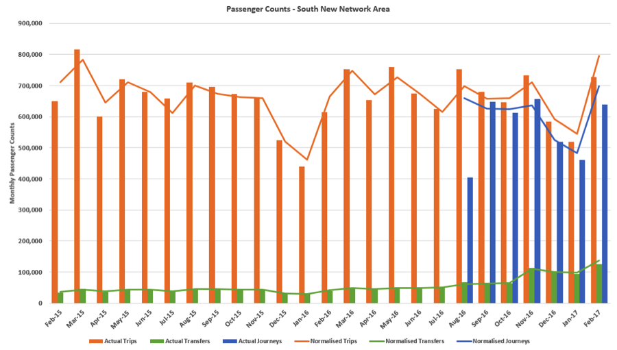
But this chart is more helpful:
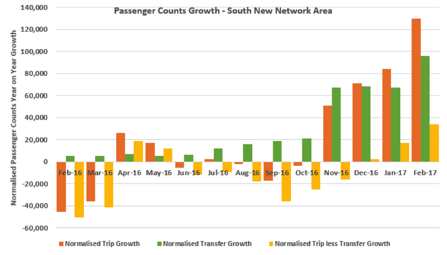
Again, the new network went in at the end of October, so it’s clearly the cause of the sudden jump.
The growth in transfer boardings is almost 3/4 of the growth in boardings, so only about 1/4 of the growth in boardings is the growth in new passenger journeys [“normalised trip less transfer growth,” the yellow bars]. So the growth in passenger journeys is around 4%, not 19%.
(Yes, the lack of consistent counting of passenger journeys [“linked trips” in US parlance] is one of several things wrong with most ridership reporting. A big jump in boardings can be just the jump in transfers, which means the network isn’t really serving more passenger trips. Many transit systems have trouble counting transfers — indeed, some fare systems leave no record of them — and there are many estimation methods out there, s0 the reporting is hard to standardize.)
Note, too, that passenger journeys are growing at a steady clip after dipping down in the first month of the new network. This is routine. It takes time to discover the new network’s benefits, and for new passenger trips to appear as a result. However, the need to transfer to complete formerly direct trips happened at once, so a sudden jump in transfers, and thus boardings, is understandable.
So if you were comparing this to other ridership figures, which tend to be about boardings, we’d say we’re up about 19% just four months in. By contrast, the regional model in Houston suggested our redesign there might achieve +20% in boardings after two years (and net of external effects that have, in fact, utterly confounded the numbers.)
Four months in, a 4% growth in passenger journeys is spectacular. This is the sort of growth I might hope for after a year. And the trend-line is very promising!
Auckland is probably one of the best models of how to properly do a transit redesign.
Instead of what we see in the USA where transit agencies are choosing what areas to provide good service to, while leaving other cities with subpar service. Auckland went the other way, and is working on building a good service for everyone. The ridership results no doubt have to do with this as well.
Very very impressed with Auckland.
+1 Auckland actually chunked the city into 6 sections and kept the service hours consistent in those sections while spreading service relatively evenly across those 6 areas. It meant that no large areas saw a decrease in service and most saw a significant increase. It’s just a shame they caved to status quo pressure from the public in the central suburbs.